Case Study / Branding
T.H. Detti Kozmetika
A feminine and premium visual identity designed to make a beauty brand memorable.
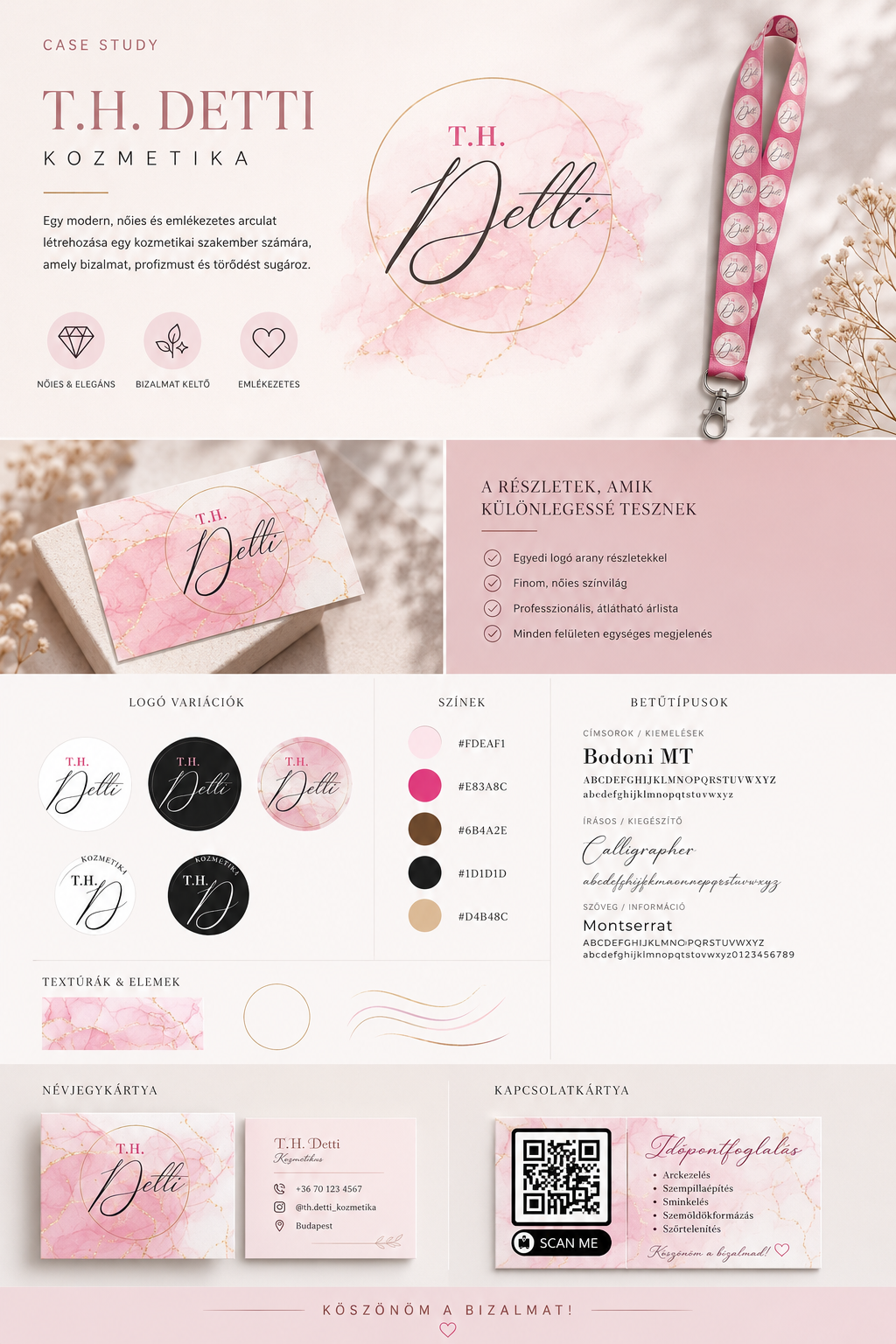
The Challenge
Create a distinctive visual identity for a beauty professional that feels feminine and elegant, while still communicating professionalism, care and trust — a brand clients remember long after their appointment.
The Solution
A single branding system that brings the logo, colour palette, typography, textures and printed materials together. Soft blush and vibrant pink are grounded by warm beige, brown and black, with marble-inspired textures and subtle gold detailing keeping the result sophisticated rather than sweet.
What I Created
- Logo design and logo variations
- Complete colour palette
- Typography system
- Brand textures and visual elements
- Business card design
- Appointment / contact card design
- QR code integration
- Branded promotional materials
Brand Identity
An elegant serif paired with a refined handwritten script forms the typographic voice, applied consistently across every touchpoint of the identity.
01
Logo variations
02
Colour palette
03
Typography
04
Textures & graphic elements
Branded Materials
A double-sided business card carries the marble texture and gold monogram, while the appointment card lists treatments alongside an integrated QR code that takes clients straight to booking.
- Double-sided business card
- Appointment / contact card
- QR code integration for booking
- Branded promotional materials
Brand Feeling
Design Result
A cohesive visual identity designed to turn a beauty business into a recognisable and memorable brand.